How to Format a Press Release: Professional Layout Guide
 Marcus RodriguezPR Distribution Specialist
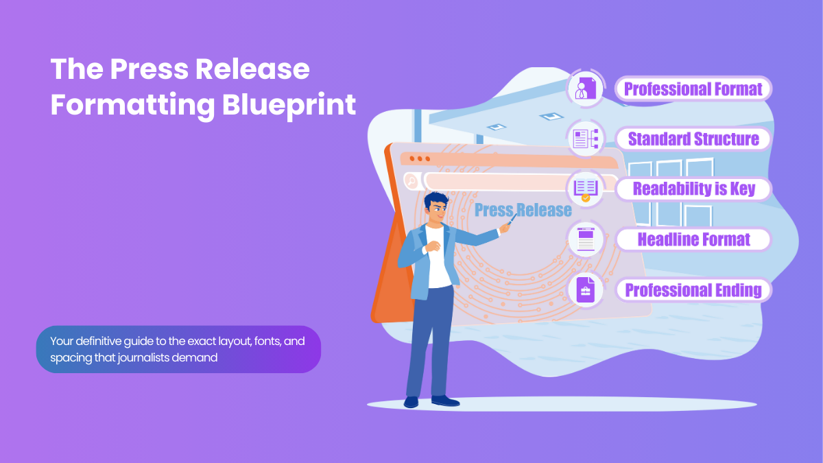
The Formatting Truth
First impressions matter in 3 seconds
Journalists decide whether to read your press release based on how it looks before they even read the headline. Poor formatting = instant delete.
I've seen brilliant stories get ignored because they looked unprofessional. And I've watched mediocre news get picked up because the formatting was spot-on. After reviewing thousands of press releases through our press release distribution service, I know exactly what separates amateur from professional formatting.
of journalists say a clean, scannable, properly formatted release makes them more likely to read it.
Source: Cision
Here's the thing: journalists are busy people who scan before they read. If your press release doesn't follow standard formatting conventions, it screams "amateur" and gets deleted instantly. But format it correctly, and you've cleared the first hurdle to getting coverage.
The Professional Press Release Format (Step-by-Step)
Every professional press release follows the same basic format. I call it the "Journalist's Expectation Template" because it gives reporters exactly what they expect to see, in the order they expect to see it.
Professional Press Release Format
Header Section
"FOR IMMEDIATE RELEASE" (left-aligned, all caps, bold)
Contact information (right-aligned)
Headline
Bold, centered, 14-16pt font, under 10 words
Subheadline (Optional)
Italicized, centered, provides additional context
Dateline
City, State, Date - (left-aligned, bold)
Body Text
12pt font, double-spaced, justified alignment, short paragraphs
Boilerplate
About section, same formatting as body
End Marker
### (centered, indicates end of release)
Typography That Gets Noticed (For the Right Reasons)
The fonts and spacing you choose send a message before anyone reads a single word. Here's what I've learned from analyzing thousands of successful releases:
✅ Professional Fonts
- • Times New Roman - Classic, readable, trusted
- • Arial - Clean, modern, web-friendly
- • Calibri - Professional, easy to scan
- • Georgia - Elegant, great for digital
❌ Fonts That Scream Amateur
- • Comic Sans (seriously, never)
- • Papyrus (makes you look unserious)
- • Brush Script (too casual)
- • Any decorative fonts (hard to read)
Spacing and Layout: The Secret to Scanability
Remember, journalists scan first, read second. Your formatting needs to make scanning effortless. Here's the spacing formula that works:
Perfect Spacing Formula
This spacing makes your press release feel less dense and more approachable. When combined with the right press release length, it creates the perfect reading experience.
Header Section: Your Professional Calling Card
The header is where most people mess up. It's not just about including contact information - it's about presenting it in a way that builds credibility instantly.
Perfect Header Example:
FOR IMMEDIATE RELEASE
Contact: Sarah Johnson
Phone: (555) 123-4567
Email: press@company.com
Website: www.company.com
Common Header Mistakes
- • Using "FOR IMMEDIATE RELEASE" in lowercase
- • Putting contact info on the left side
- • Including too much contact information
- • Using personal email addresses (@gmail.com)
- • Forgetting to include a phone number
Headline Formatting: Make It Impossible to Ignore
Your headline formatting is just as important as the words themselves. I've seen great headlines get overlooked because they weren't formatted properly.
✅ Headline Best Practices
- • Bold font weight
- • 14-16pt font size
- • Center alignment
- • Title case capitalization
- • No period at the end
- • Extra space above and below
❌ Headline Formatting Mistakes
- • ALL CAPS (looks like shouting)
- • Left-aligned (looks unfinished)
- • Same size as body text
- • Multiple fonts in one headline
- • Underlining (looks outdated)
- • Too many exclamation points!!!
Body Text: Making Every Word Count
The body text formatting can make or break readability. Even if you've mastered how to write a press release, poor formatting will kill your message.
Keep Paragraphs Short
2-3 sentences maximum. Long paragraphs look intimidating and don't scan well.
Use Justified Alignment
Creates clean, professional edges. Left-aligned looks casual, centered looks amateurish.
Bold Key Information
Company names, product names, and key statistics should be bold for easy scanning.
Format Quotes Properly
Use proper quotation marks, attribute clearly, and consider italicizing for emphasis.
Digital vs. Print Formatting: Know the Difference
Most press releases today are distributed digitally, but some still go to print publications. Here's how to format for both:
📱 Digital Formatting
- • Sans-serif fonts (Arial, Calibri)
- • Shorter line lengths
- • More white space
- • Hyperlinks in contact info
- • Mobile-friendly layout
📰 Print Formatting
- • Serif fonts (Times New Roman)
- • Longer line lengths
- • Tighter spacing
- • Full URLs spelled out
- • Traditional layout
Since most distribution happens digitally through services like our free press release distribution, I recommend optimizing for digital first.
The Perfect Ending: How to Close Professionally
How to end a press release properly is crucial for maintaining that professional appearance all the way through. Your boilerplate and closing need the same attention to formatting as your opening.
Professional Ending Format:
About [Company Name]: [2-3 sentence company description with key achievements and contact information.]
###
Common Formatting Mistakes That Kill Coverage
I've seen these formatting mistakes destroy otherwise great press releases. Avoid these and you're already ahead of 80% of your competition:
❌ The Wall of Text
Long paragraphs with no breaks. Journalists won't even try to read it.
❌ Inconsistent Formatting
Different fonts, spacing, or alignment throughout. Looks unprofessional.
❌ Missing Contact Information
Journalists can't follow up if they can't reach you. Always include phone and email.
❌ No End Marker
Forgetting the ### at the end makes it look incomplete.
Tools and Templates: Format Like a Pro
Don't start from scratch every time. Use these tools and resources to ensure perfect formatting every time:
- Microsoft Word templates - Set up styles for consistent formatting
- Google Docs templates - Easy sharing and collaboration
- Our free template - Pre-formatted and ready to use
Speaking of templates, grab our free press release templates that's already formatted to professional standards. It takes all the guesswork out of layout and spacing.
Real Examples: Formatting in Action
Want to see these formatting principles in practice? Check out our press release examples collection. You'll notice that all the successful releases follow these exact formatting standards.
Understanding what makes a good press release includes both content and presentation. Great content with poor formatting still fails.
Your Formatting Checklist
Before you send any press release, run through this checklist:
Pre-Send Formatting Checklist
The Bottom Line on Press Release Formatting
Perfect formatting won't save a bad story, but poor formatting will kill a great one. In the three seconds journalists spend deciding whether to read your press release, formatting is 90% of their decision.
Follow these standards, use the checklist, and your press releases will look professional from the first glance. Combined with solid content and proper distribution, you'll see your pickup rates soar.
Ready to Format Your Press Release Perfectly?
Now that you know the formatting secrets, it's time to put them into practice. Start with our professionally formatted template and see the difference proper presentation makes.
Remember: journalists judge your professionalism in seconds. Make those seconds count with formatting that commands respect and gets your story read.
About the Author
Marcus Rodriguez
PR Distribution Specialist
Marcus has over 10 years of experience in public relations and has helped more than 2,000 companies craft press releases that secured coverage in major publications. He specializes in startup PR and has a proven track record of earning media placements in outlets like the BBC, The New York Times, Forbes, and more, using the same techniques he shares on our blog.